Overview
Bridging Gaps in Workshop Coordination: a Comprehensive Workshop Management System for Mental Health Therapists
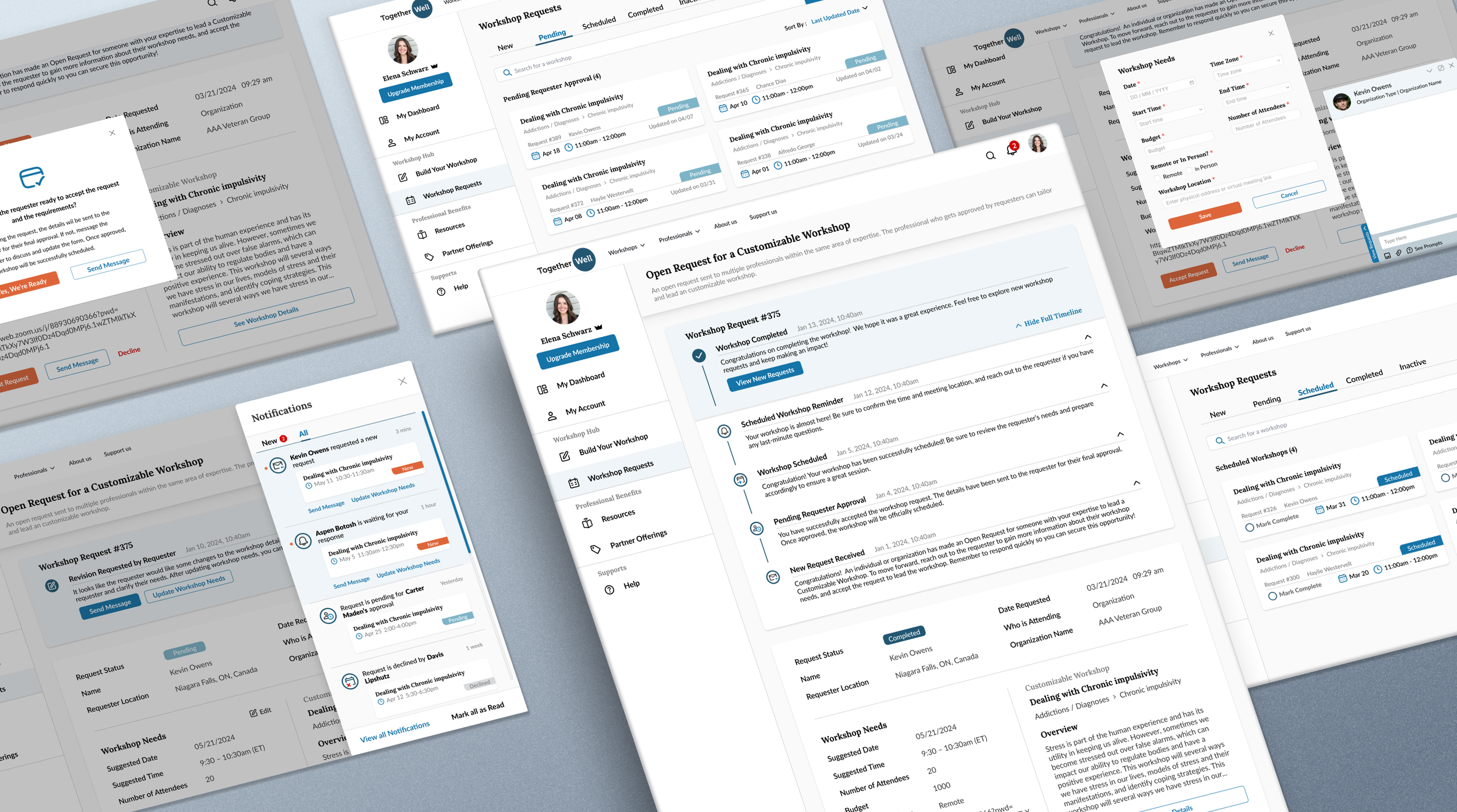
At TogetherWell, I led the design of a comprehensive workshop management flow, filling gaps in the old system that lacked essential end-to-end functionality. My design introduced complete statuses, actionable guidance, and tools to manage workshop requirements, enabling therapists to navigate each step of the request process with ease. The experience empowers therapists to focus on delivering high-quality mental health workshops aligned with their clients’ needs.
Timeline
12 weeks (Apr - Jul 2024)
My Role
Product Designer
Team
Founder (strategic alignment), PM, UX Designer (peer feedback), Developer
My Tasks
Competitors Analysis, User Interview, Usability Testing, End-to-End Workflow Optimization, Design System Improvement, Hi-fi Prototype
Tools
Figma, FigJam, Slack, Freedcamp
Background
Problems
How might we help therapists manage the entire workshop request process smoothly?
How might we help therapists manage communication and track updates, ensuring alignment on workshop requirements while keeping the process simple?
Testing Results
High satisfaction, reduced mismatches, and lower confusion
83% testing users reported higher satisfaction with the full status tracking system supporting the end-to-end request process.
65% testing users reported reduced mismatch expectations with workshop requesters through the requirements update feature.
70% testing users reported less confusion with step-by-step guidance and timely notifications.
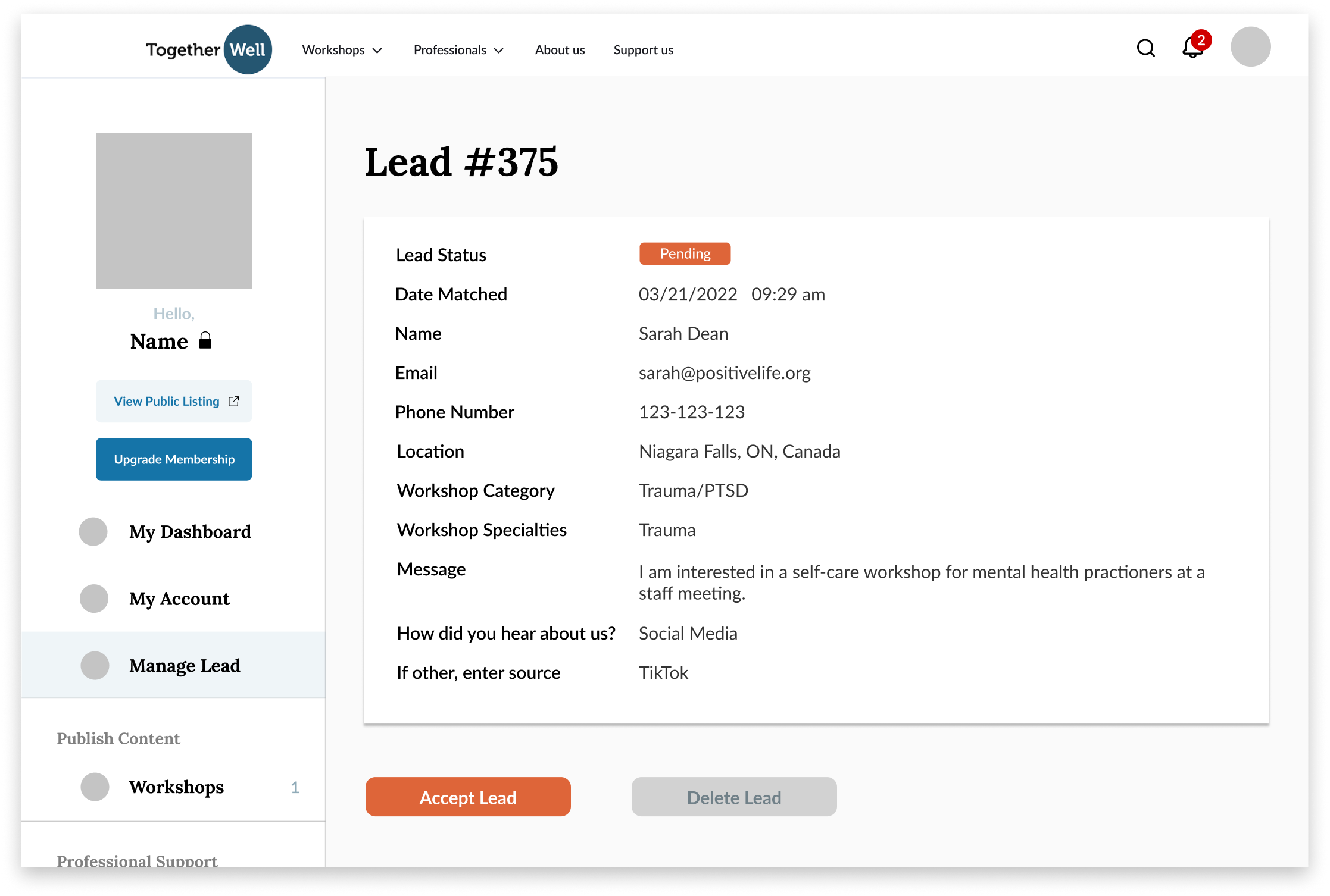
Old Solution Issue
Basic status options failed to support the full request lifecycle.
The previous system offered only basic status options (accepted/pending), which fell short in supporting the full request lifecycle from initial discussions to workshop completion.
Challenge
Flexible requests require off-platform discussions, making updates hard to track.
TogetherWell’s nonprofit model allows workshop requesters to send highly flexible workshop requests, requiring open discussions with therapists to customize workshops. With workshops hosted outside the platform, workshop requirement updates often happen via private emails, making them difficult to track.
Research
Market and Competitors Research
Understanding industry standards in booking management
I researched 4 direct competitors (online therapy platforms) and 5 similar platforms (with booking systems).
1-Way Communication Model - Quick & low-customization booking
Most competitors use a simplified model where therapists list fixed services, prices, and times, allowing clients to book directly with minimal customization.
TogetherWell’s 2-Way Communication Model - Enhances tailoring but adds process complexity.
TogetherWell gives requesters the flexibility to negotiate and customize workshop details with therapists. It supports a more tailored experience, but also adds complexity to the communication and confirmation process.
A robust support system is needed
TogetherWell’s model requires a robust support system to streamline communication, updates, and agreement on workshop details efficiently.
User Interviews Insights
I conducted in-depth interviews with 8 current users to understand workflows and pain points:
Users struggled with unclear steps, limited support, and communication challenges.
67% participants felt uncertain about next steps after accepting a request, causing drop-offs.
42% participants felt the system didn’t support unexpected situations during the request flow.
56% participants struggled to track requirement updates, losing details in fragmented communication.
48% participants were frustrated by back-and-forth communication and unresponsive requesters.
Phase 1
Enhancing Communication and Alignment in Workshop Requests
Problem
How might we help therapists manage communication and track updates, ensuring alignment on workshop requirements while keeping the process simple?
Design Decision 1
Redesign specific workshop request page and in-platform messaging
Before
Iteration 1
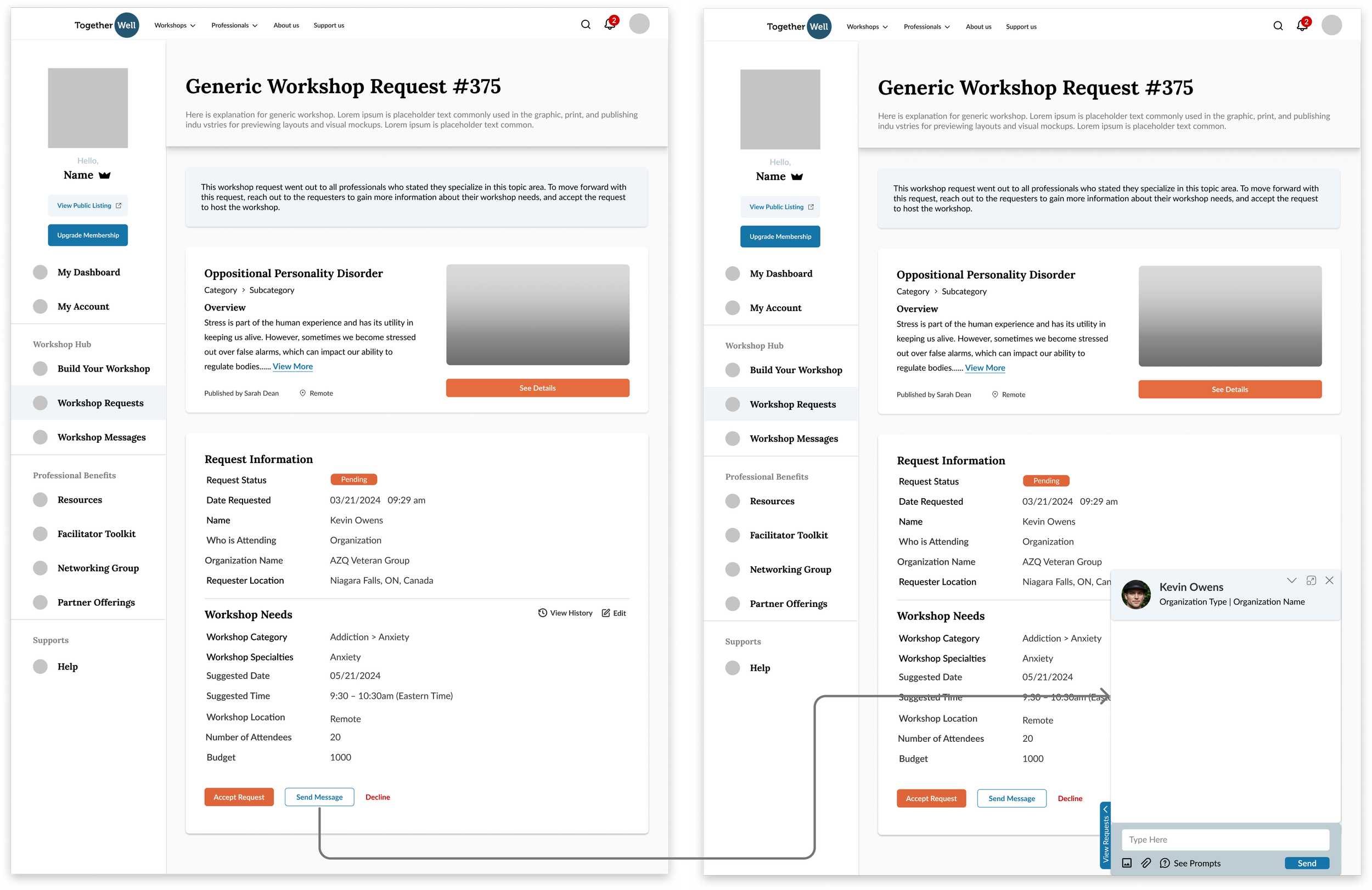
Designed in-platform chat and organized info for efficient workshop customization.
Designed a real-time, in-platform floating chat box, reducing back-and-forth email communication.
Used 2 sections to separate fixed request info and editable workshop requirements, with a reference section for the specific requested workshop
Provided guidance on next step, prompting users to contact requester for customization.
I reviewed the design with the founder, PM and UX consultants, identified issues, and iterated designs.
Main Issue Found:
Excessive information above action buttons distracts users from taking actions.
Restructured Information Hierarchy:
Essential sections: Workshop Contents, Request Info, and Workshop Needs.
Ensure Call-to-Action buttons are visible and accessible.
Final Version - Rearranged Layouts
Compact layout with side-by-side info and elevated CTAs
Positioned Workshop Needs and Workshop Contents side-by-side for a more compact layout.
Adjusted layout to keep Call-to-Action buttons upper on the page, reducing the need to scroll.
New Problem Found
How to store updates on workshop requirements due to discussion in a streamlined way?
Design Decision 2
Design an editable workshop requirements form
Iteration 1
Placed editable requirements form in Workshop Setup Section for easy editing without affecting Request Information Section.
Editable form supports in-platform updates and shared reference.
Enable users to update changes discussed with requesters in-platform.
Reduce reliance on external email and ensure both parties have shared reference for final workshop.
Main Issues Found - Limited space and chat overlap complicate editing
Limited space makes the form too compact.
Users can’t view the chat and edit requirements at the same time. The chat box partially covers the form, forcing users to minimize the chat, adding cognitive load as they try to remember details while editing.
Final Version - Pop-Up Form
Redesigned form enables simultaneous chatting and editing
Redesigned the editing form as a two-column popup to display side-by-side with chat box.
Enables users to chat and update requirements simultaneously, streamlining the editing process.
New Problem Found
How to prevent users from accepting requests without discussion and failing to meet requester’s expectations?
Design Decision 3
Add a “Pending Requester Approval” status
Unselected Design Approach - Fixed 3-step flow ensures review before accepting requests
1. communicate with requester —> 2. Update requirements form —> 3. Accept request
“Accept Request” button is only accessible after completing all steps to ensure thorough review.
Why Rejected - Inflexibility and added complexity
Inflexible: Real-life scenarios often needs multiple updates, this linear process cause extra user efforts for iterative adjustments.
Complexity: The long process with a minimum of 7 clicks would lower efficiency and user motivation.
Final Version - “Pending Requester Approval” status
“Pending Approval” status simplifies acceptance flow and ensures alignment
Introduced a new status “Pending Requester Approval“ into system:
Therapist accepts request ➔ Enter “Pending” status ➔ Requester reviews and approves ➔ Once approved, the workshop is successfully scheduled.
Simplify the workflow for therapists to accept request—> takes only 3 clicks.
Effectively ensure both parties are aligned on requirements, reducing mismatched expectations.
Phase 2
Strengthening Workshop Management Process with Comprehensive Status Tracking and Guidance
Problem
How might we help therapists manage the entire workshop request process smoothly?
Design Decision 1
Design a complete end-to-end status system with supports to different situations
Old Status System - No tracking or support for next steps and real-life changes
Lack of support on next steps after accepting a request, with no defined process to track and manage each status beyond the initial acceptance
The system lacks support for real-life scenarios, such as handling unexpected changes or edge cases (e.g., late cancellations, revision requests)
Restructured Status System - Cover all scenarios and keep users moving forward
With feedback from the founder and therapists, I restructured the status system.
Defined the whole management process, including declined requests, delays, revisions, scheduling, pre-workshop reminders, and late cancellations.
Ensure system assists users to move forward in all scenario.
Old Status Definitions
New Status Definitions
Redefined clear, action-oriented status names with feedback
I explored different status names and gathered feedback from the founder, content writers, and therapists.
Ensure status names intuitive so users can quickly understand each step and its sequence.
Focus on Action: therapists are more concerned with statuses that require actions on their side.
Avoid Ambiguity: terms like “accepted” and “approved” lacked clarity on who performed each action.
Redesigned All Workshop Request Page
Before - 2 status
Iteration 1 - Applied all status
Main Issues - Overwhelming, limited info space and non-responsive
Displaying all statuses together overwhelms users, making it difficult to understand the sequence and prioritize tasks.
Limited Space for key info (e.g. category, subcategory, etc).
Expandable list style lacks clarity on where to click
Non-Responsive: Not optimized for mobile use.
Design Review Insight - Therapists need clarity on active vs. inactive requests
Therapists need clarity on actionable items: Which requests still need their attention?
Inactive requests should be separated, as therapists prefer not to revisit them constantly.
Final Version - All Workshop Request Page
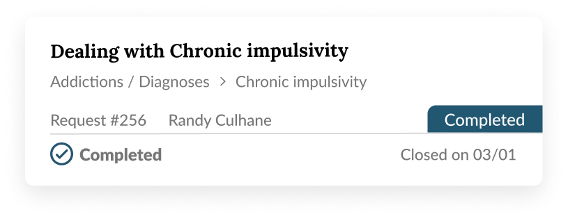
Improved clarity and usability with tabs, cards, and prioritized info
Tabs: organized requests with tabs to separate active from inactive requests, clarifying status sequence.
Card style: display more information with larger clickable areas, drive action, enhance mobile responsiveness.
Info Hierarchy: prioritized key info on card by making them visually prominent based on user-ranked priorities.
Status-Specific Time Labels: tailored time labels for each status to ensure clarity and relevance.
New Problem Found
How to help therapists stay updated on each status and their required actions?
Design Decision 2
Design relevant actionable guidance, process timeline & notifications
Process Timeline Design Process
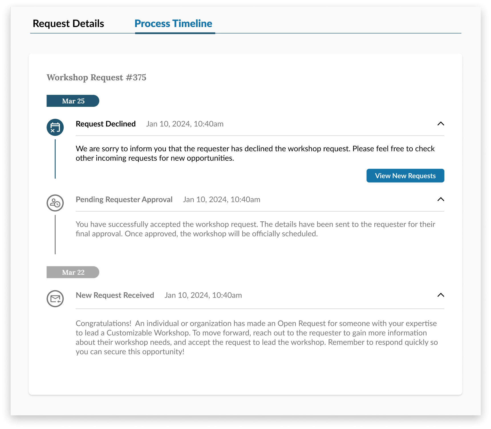
Iteration 1 - Process Timeline
Iteration 2 - Process Timeline
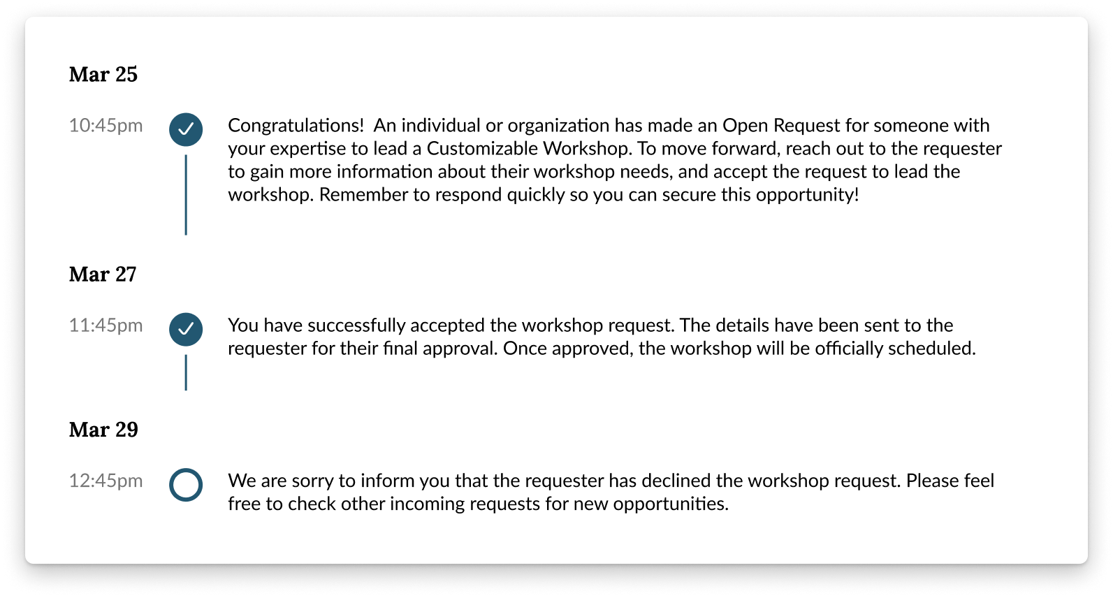
Improved timeline with key info, scannability, and focused user actions
2 subpages ➔ placing the timeline as a reference for key information.
Short titles and absolute timestamps ➔ improve scannability and referencing.
Collapsible timeline ➔ save space.
Grayed out past status and highlighted the current status to focus user attention.
CTA for the current status ➔ guide actions.
Highlighted dates ➔ quick scanning.
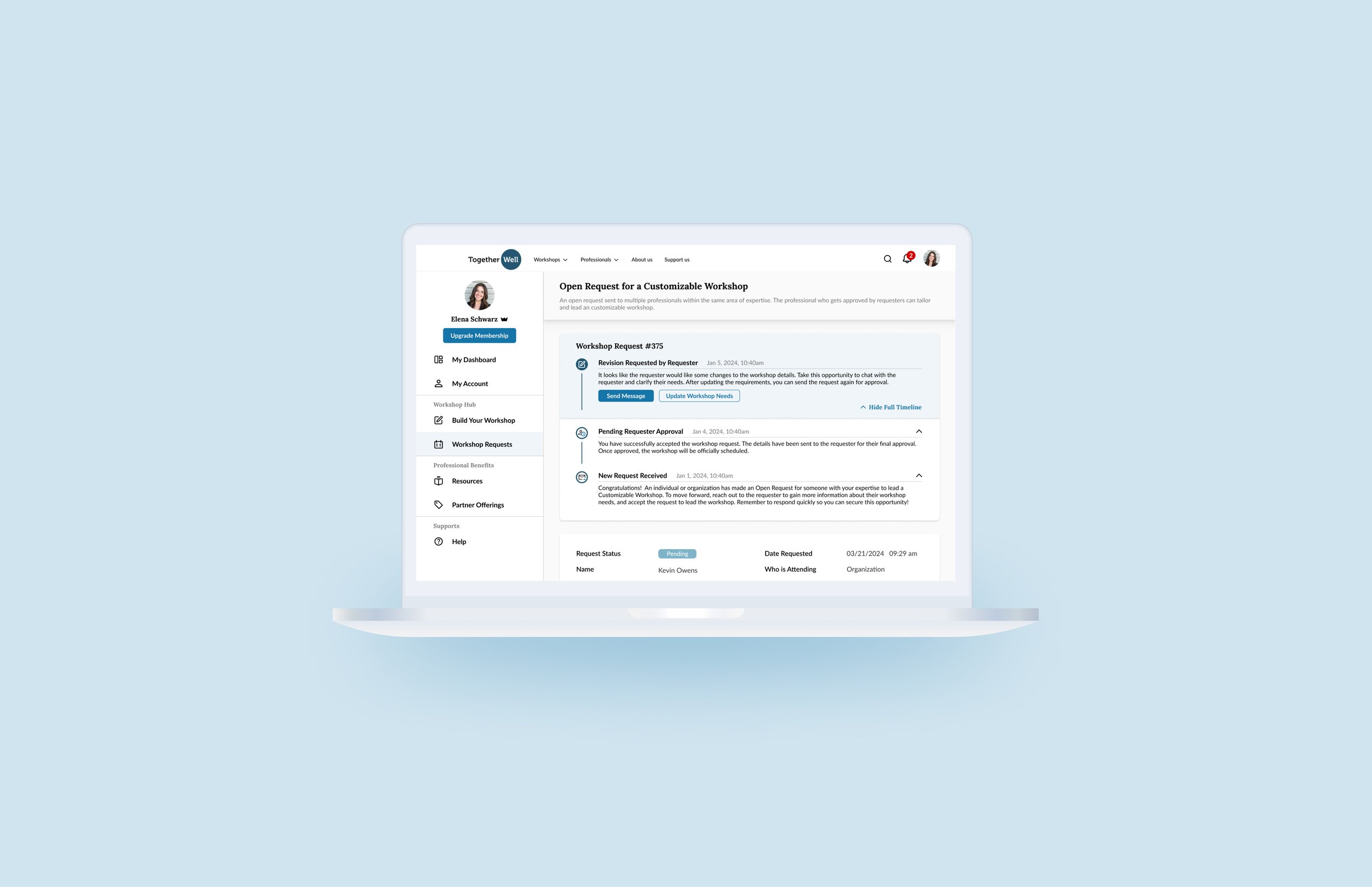
Final Version - Expandable Process Timeline Section
Simplified one-page layout with color separation and strategically placed action buttons
Placed “View Full Timeline” button below current status guidance to prioritize key info over past history.
Clear Visual Separation: used colors to separate current and past statuses
Immediate action buttons (e.g. “Send Message”) are below guidance, while “Accept/Resubmit Request” remains only at the bottom to prevent premature acceptance.
Notification Design Process
Small Notification Box - Simplified notifications for clarity and quick scanning
Removed status descriptions to save space and keep users focused on key details.
Kept only status title for concise, easily scannable notifications.
(Selected) Large Notification Box - CTA buttons with larger box for clarity and capacity
Added CTA buttons for action guidance, removing button borders for a cleaner look.
Chose larger box style to accommodate key information, allowing more notifications per page.
Final Version - Highlighted requester and workshop for easy identification.
Highlighted requester and workshop for easy identification
Emphasized the requester’s identity and specific workshop requested to ensure clarity, helping users immediately identify which request and which requester each notification relates to.
Reflection
Potential Impacts
Due to resource constraints in non-profit, the project has not yet launched with limited development capacity. The design handoff is well-prepared for implementation, and I’m excited about it’s potential impact.
Trackable Metrics for Workshop Management System
If launched, I would track the following quantitative metrics to assess effectiveness:
User Engagement: monitor average time on the dashboard and interactions with key features.
Task Completion Rate: monitor completion of specific actions like messaging and updating, ensuring ease of use in each step.
Drop-off Points: identify specific points where users most often disengage. Track user flow through each process stage, pinpointing friction points that may need extra support.
Challenges
Balancing flexibility with simplicity
Designing for a platform with a unique two-way communication model was an entirely new challenge for me. Unlike more rigid systems with fixed workflows, I had to build flexibility into the workshop management process while keeping the interface intuitive. Balancing the complexity of customizable workflows with the need for simplicity required constant iteration and feedback from UX team, therapists and stakeholders.
Lessons Learned
Design for scalability & Anticipate real-life scenarios
I learned the importance of scalability. The designs had to address various real-life scenarios, like late cancellations or revisions, that might not happen often but are critical. This experience reinforced my belief in proactive design: identifying problems in the process before they arise, rather than reacting to them after launch. Also, working with limited resources taught me how to prioritize features that deliver maximum value.
Emphasizing key tasks and de-emphasizing less critical info
I learned that adding more features or information isn’t always better, as it can overwhelm users. By creating a clear information hierarchy, I ensured high-priority content like current status and critical actions stayed prominent, while less relevant details were de-emphasized. This approach guided users through the primary task flow efficiently, minimizing distractions and keeping the focus on what matters most.


